The AA app
Writing copy for small spaces.
Problem
The AA (the automobile association) was founded in 1905 to provide guidance, support and services to British drivers. Fast forward to 110+ years and their mobile app felt like it was trapped in 1905. It was dated, clunky and unresponsive. As part of a larger digital transformation project, The AA wanted to bring their app into the 21st century.
Solution
I worked in a large design team made up of digital and UX designers, researchers and developers to revamp the app. We explored and developed a number of options and tested our approach along the way with actual AA members.
At each iteration stage, I tweaked and adapted the copy making sure it was easy for users to understand, use and follow whether you were following map directions or calling for roadside assistance.
Impact
The new app is considered the ‘ideal driving companion’ for AA members. It helps members find their way, stay up to date on traffic and accidents and makes it easy to call for help. The app’s traffic also increased by 30% and is currently rated 4.8/5 in the app store.
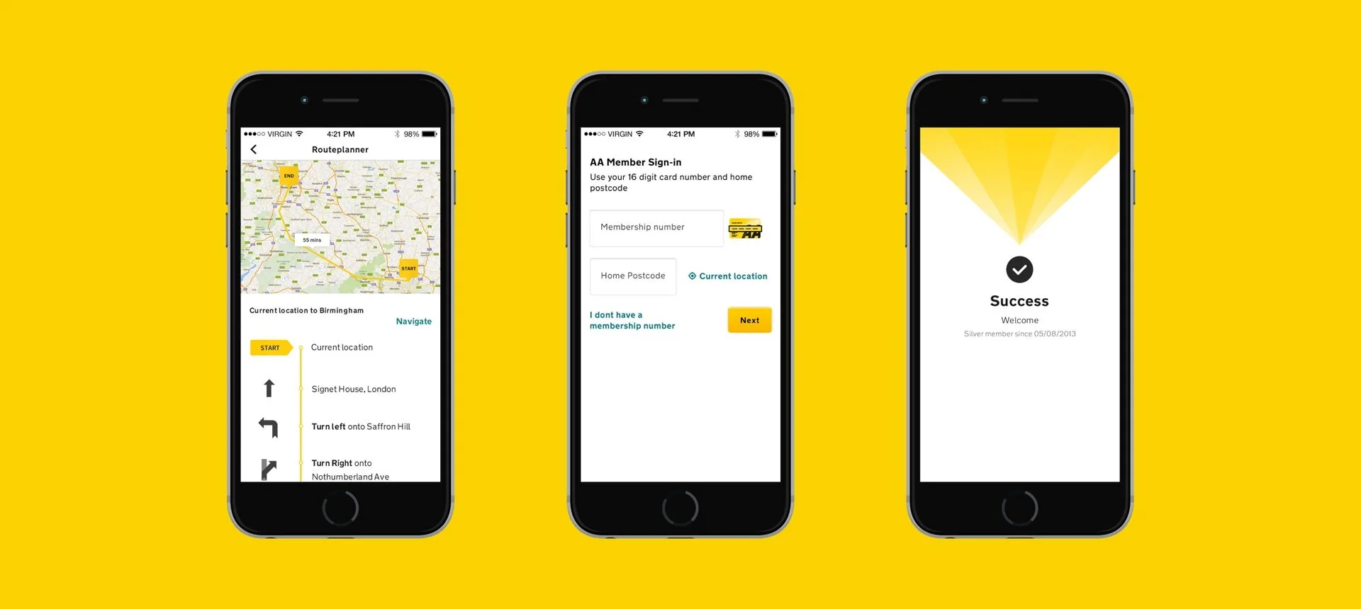
A series of mobile phone screens showing The AA driving app. Credit: Rufus Leonard
Key skills
UX and UI writing
User personas
User journey mapping
Content design
Wireframing
User testing
Read the full case study here.